

A commuter-focused glance that demands craft
The city moves like a pressed citrus—bright, fast, sharp—and signage must slice through that rush with clarity. For daily riders, a letterform with sub-millimeter alignment feels right under the eye; it reads like a clean note in a noisy room. That’s why thoughtful systems of public transport signage matter: they translate crowd flow into readable choices, and they do it under rain, glare, and the scrub of hundreds of palms. Transport for London provides a simple real-world anchor—display placement and legibility there determine how quickly thousands of commuters orient themselves each morning, a practical demonstration of design serving people rather than the other way around.

Material precision: why 316 stainless and tight tolerances matter
316 stainless steel carries a cold, satin weight that resists salt, grime, and the small violence of urban life. When cut to sub-millimeter tolerances, characters stay crisp; edges don’t cast misleading shadows. Use of 316 combined with an anti-graffiti coating and robust mounting brackets keeps signs readable without frequent intervention. Consider IP65-rated housings where electronics live, and pick durable substrates so that fast-moving hands and buses passing close by don’t shift the message. The tactile finish—smooth, slightly cool—signals permanence to users and lowers maintenance touchpoints over time.
Design details that reduce commuter friction
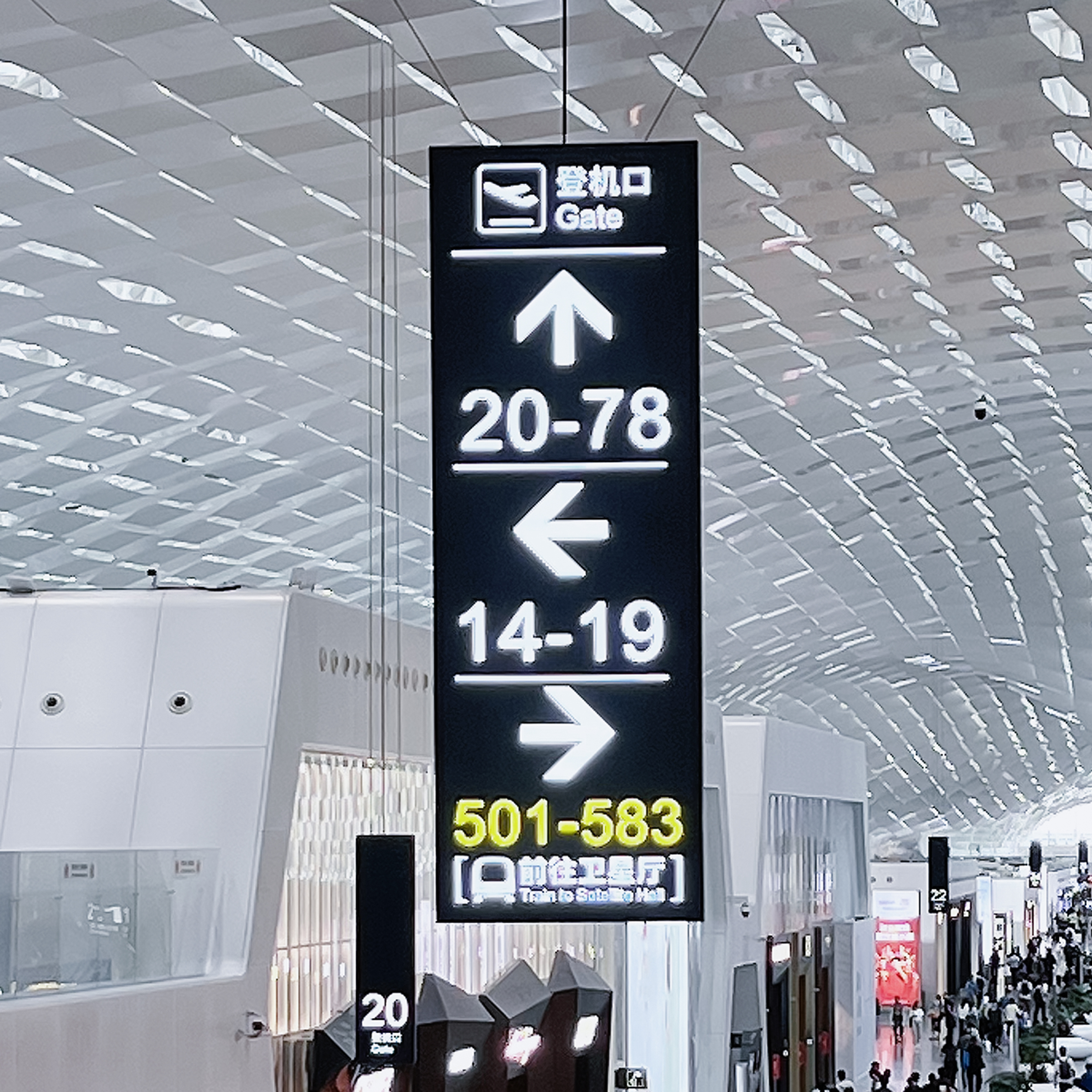
Legibility is a texture. High-contrast paint, anti-glare matte, and consistent kerning let a glance register the information. Keep iconography bold, spacing roomy, and viewing distances tested against real sidewalks. Digital pieces—like an LED matrix showing arrival times—must integrate with printed markers so the whole ensemble speaks the same visual language. Where screens go, apply ventilation, glare control, and clear wayfinding hierarchies so commuters locate stops, exits, and ticketing quickly; this kind of coordination turns individual signs into a system that behaves predictably.
Common mistakes and smart alternatives
Projects often err by polishing aesthetics and neglecting practical wear: over-polished edges that reflect into commuters’ eyes, fasteners that corrode, or fonts chosen for looks rather than read distance. Another frequent slip is treating digital and analog as separate problems; they are companions and must share placement logic and maintenance plans. Alternatives when stainless is overkill: powder-coated aluminum for lighter mounts, or rigid acrylic for colorful wayfinding panels—but those need UV-stable inks and secure brackets to match the longevity of 316. For dynamic needs, pair fixed plates with transportation digital signage where updates are frequent, and ensure both share the same mounting plane to avoid visual clutter.
Three golden rules to evaluate signage for transit
1) Readability under stress: test signs at peak crowding and in varied light; measure legibility distance and contrast ratios. 2) Maintenance economy: choose materials and finishes that lower touch frequency—corrosion resistance, anti-graffiti layers, and accessible fasteners save hours and funds. 3) System coherence: unify analog plates and digital displays with consistent wayfinding logic, mounting heights, and color cues so riders never reorient mid-journey. These metrics translate design into measurable outcomes—faster boarding, fewer missed connections, clearer routes. – small refinements yield large returns.
Final take: craft that commuters trust
Precision in material and detail—especially when using 316 stainless with sub-millimeter tolerances—creates signage that reads like a promise to riders; it’s why transit planners pair tactile plates with modern transportation digital signage for clarity and resilience, and why experienced teams default to proven substrates and mounting systems for long-term reliability.
Cosun Sign understands how those choices translate into mornings that run smoother, and into signs that feel quietly reliable to the commuter’s hand and eye.